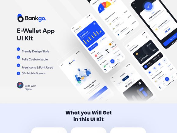
Bankgo: The Ultimate E-Wallet App UI Kit for Figma
Imagine launching a sleek, professional e-wallet app in record time, with a design that feels both modern and intuitive. That’s the promise of the Bankgo - E-Wallet App UI Kit, a comprehensive Figma resource packed with over 50 pixel-perfect screens. This kit is built for designers and developers who want to create outstanding finance, payment, or banking applications without starting from scratch.
What makes this UI kit stand out is its thoughtful organization and deep integration with Figma’s features. It leverages global color and font styles, dynamic components, and variants, making customization seamless. Whether you prefer a clean light theme or a sophisticated dark mode, the kit includes both, ensuring your final product looks polished on any device. The organized layers and artboards mean you spend less time navigating files and more time crafting the user experience.
Designed for a Range of Financial Applications
The versatility of the Bankgo kit is one of its strongest assets. Its modern, clean aesthetic is perfectly suited for a variety of industries and projects. Consider using it for:
- E-Wallet and Mobile Payment Apps: The core focus, providing screens for transfers, QR scanning, and transaction histories.
- Finance and E-Banking Platforms: Dashboards, statistics, and profile management screens are ready to be customized for broader banking services.
- Subscription Management or Fintech Startups: The onboarding and login flows can be adapted for any service requiring secure user authentication and a clear user journey.
Practical Features That Save You Time
Beyond its visual appeal, the kit is a practical design asset. It includes over 70 reusable components, which are essential for maintaining consistency across your app. From buttons and input fields to complex card elements, these components can be mixed and matched. The use of free fonts and icons also means there are no hidden licensing costs for your project’s typography and iconography, a crucial consideration for commercial work.
For any designer, choosing the right design system or UI kit is about balancing aesthetics with functionality. A kit like Bankgo provides a strong foundation in both. Its modern typography and clean layout contribute to a professional brand identity, while its structured component library ensures visual consistency and speeds up the design-to-development handoff. It’s not just about looking good; it’s about creating a reliable, scalable design language for your product.
Tips for Integrating This Kit into Your Workflow
To get the most out of a resource like this, start by exploring its structure. Familiarize yourself with the layer naming conventions and how the color and font styles are applied globally. Test different screen combinations to map out your user flow before diving into customization. One of the best practices is to use the provided components as a starting point—adjust colors to match your brand palette, swap in your preferred typeface if needed, and modify layouts to fit your content strategy.
Remember, a great UI kit is a tool to elevate your work, not a constraint. The Bankgo - E-Wallet App UI Kit offers the creative flexibility to build an app that feels uniquely yours while benefiting from a proven, user-friendly design framework. It’s an investment in quality that can help transform your concept into a polished, professional digital product that users will trust and enjoy.